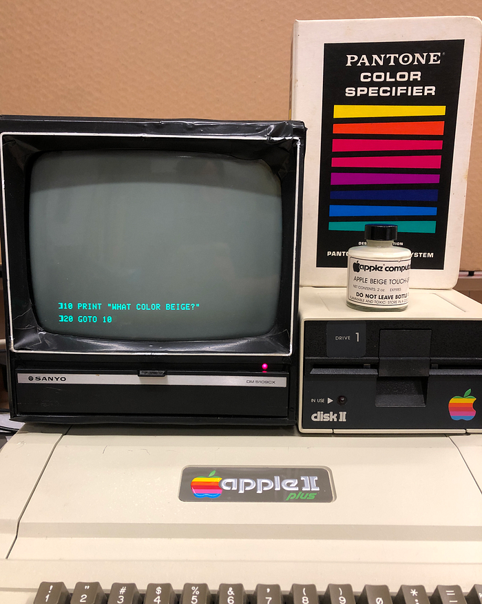
I went looking for a defining color of its era. I found it in an old jar of paint.
Apple’s second computer — its first to have a case — launched in 1977, and that boxy beige Apple II was soon everywhere: in classrooms, living rooms and offices. At the vanguard of a generation of personal computers to come, it featured a particular and carefully-chosen beige. But what did that look like? Those first machines — the ones that have escaped landfills anyway — have shifted in color over 40 years. The documented public record is sketchy and confused. But I stumbled upon a way to investigate what Apple Beige was like.

I came by this relic, a remarkable artifact of the fledgling home computer era. It’s a small glass jar filled with an oil-based paint — there’s a little brush built into the cap, and the monochromatic label glued to it sports the old Apple Computer Inc logotype and the title “Apple Beige Touch-Up Paint”.
This is the green-inflected cool beige of the original Apple II computer cases. Unlike later models, these first Apple cases were manufactured with a sprayed-on paint finish. Scrapes and other abuse could damage the surface. Hence the need for a touch-up paint, a handy item apparently available only to dealers for use on their repair benches.
It stands to reason this still-fresh paint may be the closest you can get today to that original color. I made a couple “swatches”, a layer on coated paper (which worked well) and two coats on a primered wood shim (worked less well). And I compared the swatches to a surviving Apple II and to other known color references.

Aren’t the computers themselves living examples of Apple Beige?
Sort of! But it’s a bit unreliable. All paints shift color with exposure to light over time, and this is true of the painted case machines (Apple II, II+, early IIe). Interestingly, these early finishes have aged better than later ones. Apple was small and running so lean in those years that retooling for higher quality ABS injection molding (using integrally-dyed plastic) didn’t become a priority until about 1984. The dyed plastic computers are today mostly discolored to nauseating yellow-browns. (That includes all of the early Macs, too.)
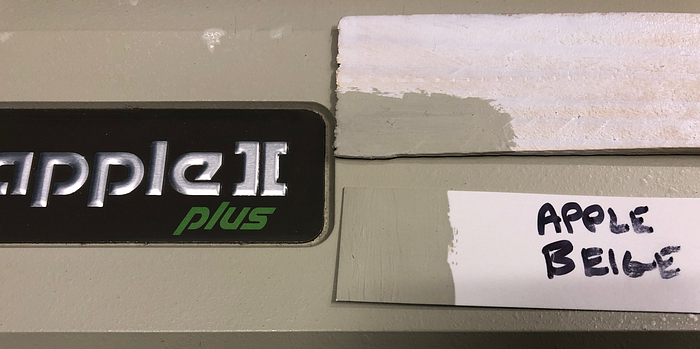
I checked my homemade swatch of Apple Beige against the case of a reasonably well-preserved Apple II+ (circa 1980). It depends on the light you’re seeing it under, and although it’s very close, the old paint appears to be just a bit more yellow than the fresh swatch.
This seems to confirm that the touch-up paint is the right original color, and also confirms that existing early Apple II computers don’t today look terribly different to their original finish. So what color is it?
The public record is inconclusive.
Jerry Manock was the industrial designer of the Apple II as well as later machines including the original Macs. Manock recalled in 2012 that the color he specified for the Apple II case was “Pantone 453”. Pantone is the industry-standard color matching system originally catering to print designers and more recently textiles and various other domains. This 2012 Manock factoid has been repeated elsewhere on the web. Case closed, right?
But Manock’s projects get conflated in the written record. In Paul Kunkel’s encyclopedic 1997 book “AppleDesign: The Work of the Apple Industrial Design Group,” Manock is said — in referring to the Macintosh — to have chosen “a tawny brown color known as [Pantone] 453, which he thought would age more gracefully than any other.”
Update: I corresponded with Jerry Manock following the publication of this article, and he provided a lot more useful context. Please read that, also, to get a more complete picture.
Apple’s first CEO, Michael Scott (true!), actually used the Apple II beige as an illustration of Steve Jobs’ notorious fussiness. Here he is in a 2011 interview:
…for all the standard colors of beige available in the world, of which there are thousands, none was exactly proper for [Steve Jobs]. So we actually had to create “Apple beige” and get that registered.
Yet Scott is also quoted in Walter Isaacson’s 2011 authorized biography of Jobs as saying
The Pantone company, which Apple used to specify colors for its plastic, had more than two thousand shades of beige. “None of them were good enough for Steve. […] He wanted to create a different shade, and I had to stop him.”
There weren’t actually thousands of beiges; the 1970s Pantone color set contained fewer than 1,000 colors total, and as a friend explained to me, print designers don’t have a frequent need for beige, so those shades aren’t especially well represented.
That aside, Scott’s evidence seems mixed here. The biography seems to say that he forced Jobs to pick a Pantone (?) color, but the interview clearly says the case paint was a bespoke creation, signed off on by Jobs personally.
Pantone, then and now.
Here is a binder full of Pantone color chips from 1972, representing the extent of that color universe in the era. Each shade has a sequential number, and the highest values were in the 800s. There are two full sets of tear-away chips in this book, one on uncoated paper stock and one on coated paper stock.

The coated vs. uncoated distinction remains today, and these original three-digit numbered colors are now designated with a “C” or a “U” suffix respectively. Since the 1970s, Pantone’s color selection offerings have proliferated, going beyond the print domain into textiles and paints, and adding many many more additional shades in between the older colors.
Here is the older page containing beige 453.

No luck. This photo’s color levels make the comparison swatch look darker than in real life, but even in real life, the Apple Beige is darker and more green than 453 or anything else in this book. (If anything, shade 414 is closer.)
If you’re a design professional, I can now hear you screaming at me: you’re supposed to replace your Pantone chips every year or two — these things are a half-century old and can’t be trusted! Of course, that is correct. Here is a current example, photographed in natural light:
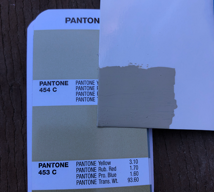
Same problem. The 1972 book’s colors have gone a tiny bit off now, but the comparison is basically the same. It’s just not a close match. Note that in all these comparisons, the ambient lighting can make an enormous difference to absolute perception, and also in corresponding photos. You’ll have to take my word for the differences!
So the Apple II, whatever it was, was something other than Pantone 453. Now even if a surviving Apple II case is very close to the fresh paint color, we still don’t know what color that is.
Fortunately the Pantone universe has expanded significantly since 1977. The print beiges still don’t have a very close match to Apple Beige, but it turns out, the textile/interiors color set does, and it is called “Overcast”:

A.k.a Pantone 14–0105 TPG. This is the best match across all of the contemporary fan book sets that my designer friends had at hand. It is not quiiiiiite indistinguishable, but it is verrrry close, with the greenishness that 453 lacks. If you are looking for a current Pantone lacquer color that matched the Apple II was when it was new in 1977, I’d tell you to ask for Overcast 14–0105 TPG.
Who cares about Pantone? What if I want some paint?
I brought my little swatches down to the local hardware store, since they sell paint and have a selection of color samples there. The closest house paint they carry is PPG’s “Heavy Hammock.” They sell Rust-Oleum spray enamel, and that has a near match with “Gloss Almond.”

So if you want your house to look like an Apple II, ask for Heavy Hammock but maybe just a wee hair lighter toward Skipping Stone. For your deck furniture, go with the spray Gloss Almond. (You’re on your own for automotive.)
Does the touch up paint actually work?
Great question! My Apple II+ has some deep scrapes in the case that expose the underlying plastics through gouges in the paint finish. I figured I might as well use the touch-up paint to touch it up. Here are the results:
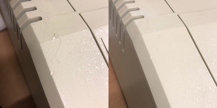
It’s a pretty good match to the current color of the case, but you can see the patching if you look closely: the new dabs appear a hair lighter and more neutral in tone than the surrounding paint.
I hope that deep in the bowels of Apple’s industrial design group archives, there exists an old sheet of paper with the color mix recipe for Apple Beige written down on it. Colors imprint in our collective memory and have the power to reflect cultural meaning. This beige ushered in personal computing, which eventually helped change the world.
Update: After writing this article, I contacted Jerry Manock, who very kindly clarified some of the unknowns here and casts the result in a different light. It turns out, in theory, the Pantone 453 was the intended color. In reality? It’s complicated. I wrote a follow-up sequel to this article. Please go read that next!
If you dig seeing iconic vintage stuff restored and repaired follow my Instagram account here. All text and photos above are copyright © 2021 by Ben Zotto. You can contact me at bzotto at Gmail dot com. Thanks to Emily and Greg for their design expertise.
