I recently published a fairly well-circulated investigation on the origins and specific color known as “Apple Beige,” based on a surviving jar of original touch-up paint from the 1970s. This was the shade of the first Apple computer to have a case.
My conclusions, based on available written sources, were wrong. Or, in any case, incomplete. Jerry Manock, the original designer of the iconic cases and the person most closely associated with Apple Beige, was kind enough to respond in detail to my inquiries following the article. There’s more to this story than just a color swatch.
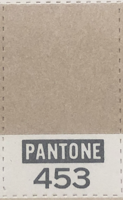
“Pantone 453” was, in fact, the intended color
Because the paint I have (and the Apple II+ computer case I have) is not a good match to Pantone 453, I concluded that the Pantone reference must have been the spec color for the later Macintosh, not the earlier II.
The reality is more complicated: Manock assures me that Pantone 453 was the source color for Apple Beige. And not just for the Apple II but also by extension for the Macintosh. Yet given the process at the time, it’s perhaps not that surprising that neither really matched it. Manock tells me:
The first Apple II’s were painted with a textured paint from a vendor (don’t remember the company… maybe Sherwin Williams) that were given a Pantone 453 reference. God knows how this paint varied from batch to batch… we didn’t have much [quality control] at the time.
Pantone was a print designer’s color system, not a paint specifier. Handing an inked paper sample to the paint supplier didn’t guarantee you a perfect match. It seems possible that there was both batch variation and perhaps an overall small shift from the pure Pantone reference to a more unique Apple Beige.

Apple II paint was textured to hide early manufacturing defects
Manock clarifies how the early cases were molded and produced. They were made with wooden mold parts and were so variable in quality that they needed to be hand filled and sanded before painting!
We found a reaction injection molder in San Jose, CA (I think) who made early Apple II housings with wooden tooling. There were lots of bubbles and defects that had to be filled with Bondo then sanded. Thus the need to paint with a textured paint. When asked “what color” I probably gave them a Pantone 453 chip. The [molding] vendor acquired the paint and did the painting… Later, when the housings were being made by Tempress in Seattle using aluminum tooling, there were far fewer defects. These units were also painted with a textured paint that was sourced by Tempress. I don’t remember any color or gloss [quality control] on the incoming parts. This was also the way the housings for the Disk II’s were sourced.
Fascinating (though obvious when you think about it) is that the texturing, originally done to hide imperfections, was carried through the rest of the later line for consistency, even when surface quality was no longer an issue.
Enter Albert Munsell
I shared my earlier story about Apple Beige with Chris Espinosa, the only current Apple employee who was around back when the Apple II was being developed (!). He was “surprised at the focus on Pantone because my work with Jerry [Manock] was always in Munsell.”

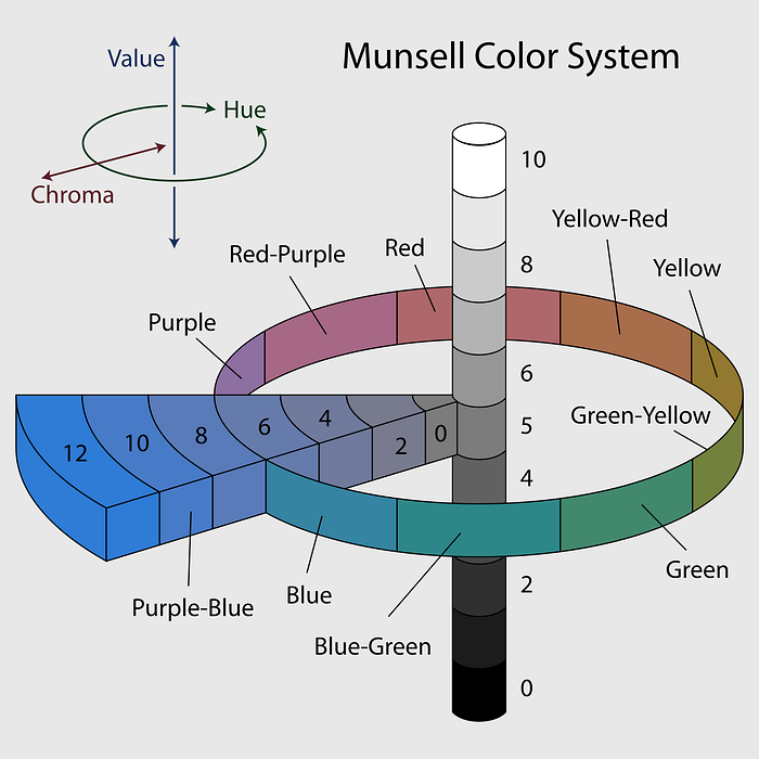
Albert Munsell was an artist and art teacher active around the turn of the 20th century and is best known for creating and evangelizing his eponymous Color System. Munsell broke down color into hue, chroma, and value.
One of the first scientific approaches to quantifying color that modeled human perception, Munsell’s notation specifies each shade along the three axes. The result is an easy-to-understand way of thinking about colors and their relation to each other. Munsell’s system was smart and durable and is still in use today. If your primary reference for colors is the RGB model, I encourage you to take a look at how Munsell works, it’s very cool.
Munsell himself thought giving names to colors was “foolish” and “misleading.” I don’t know what he would have made of Pantone, a color system with an internal but nonscientific logic — at least they embraced the austerity of numbers.
Standardizing on Munsell
Manock confirmed that once Apple industrial design progressed beyond the early scramble to launch the Apple II, Pantone would not have been used for product and paint specification:
Later we evolved to specifying color (paint and ABS plastic) using the Munsell System which was a very accurate tri-axial (Hue, Value, Chroma) numerical control MUCH better than Pantone […] Pantone color specification is very error prone. [Ultraviolet light] is responsible for Pantone fading AND for the “yellowing” seen on aging ABS plastic housings. We had gone way past using the Pantone notation for paint and plastic. Some Apple graphics people probably still used it for print (ink) color specification purposes.
In addition to a general suitability to task, the Munsell notation provides a handy formal way of identifying complementing and contrasting colors. By way of example, Manock points to “the medium brown key caps on the Apple III, which were exactly half way between the Apple Beige and the dark brown paint we used on the aluminum die casting.”
Manock set up an internal Apple Product Design Guild as a place for all designers across divisions to share information and suspects that the Munsell consensus would have originated within that group.

Apple Color Quality Control
With increasing sales volumes of the II and an expanding product line in the wings, the change was eventually made to formalized color compliance. Manock says:
I think it was not until the Apple III die castings were painted a textured dark chocolate brown.. that a more accurate color QC [quality control] process was implemented… By this time QC was using Munsell color variance chips for incoming inspection. All the QC people were tested for their color acuity.
Seeing and validating color turns out to be pretty hard! There’s a fun online test here you can take to see how well you can distinguish similar Munsell hues. Could you have made the cut for the color QC staff?
Ten Years of Beige
Eventually injection molded ABS plastic was adopted in the Apple II division (sources place this changeover at the start of, or during, the Apple IIe product timeline — so sometime after early 1983). ABS plastic uses integrated color dye; paint was no longer used. Manock tells me that “Rob Gemmell was the lead product designer for that division and may have had a color match done for the beige color of the painted Apple II’s using the Munsell notation.”
The big finale for Apple Beige was its use on the original Macintosh (1984) product — another Manock case design. He confirms that the “Mac plastic color was specified using the Munsell notation for the Apple II beige.”
Apple Beige stuck around in the Macintosh and II lines for a bit longer but its days were numbered. The Apple IIc (1984) was the first product to be released using the new “Snow White” design language, and with it, a new case color — a lighter offwhite referred to as “Fog.” Fog was short-lived; the new styling remained but warm-grey “Platinum” was the color that all product lines quickly converged on and which remained the standard well into the 1990s.
The final lingering product to sport the original Apple Beige may have been 1986's Macintosh Plus, before that model (along with the venerable IIe) was finally updated to Platinum in 1987.
That gives Apple Beige — specified by Manock in 1977 with a Pantone chip, actualized with questionable accuracy by third-party case manufacturers, formalized from those cases using Munsell parameters and then used for all Apple dyed plastics of the era — about a decade-long run. Not bad!
Colors come and go in trends, and it was inevitable that the ubiquity of beige computers would lead to a backlash. What was once surprising became known as boring Apple beige. But Manock tells me that the cosmos has validated his choices— in the early 2000s astronomers determined that the average color of the universe is a shade christened “Cosmic Latte”… in other words: beige.
Heisenberg’s Beige
I find myself back at the beginning. What color was Apple Beige? I’m no longer sure there exists any satisfying answer to that question. One valid choice is Manock’s intended “Pantone 453.” But it seems very plausible that the computers were never quite that.
Eventually, the beige was formalized and subjected to validation, no later than the c. 1984 move to ABS injection molded plastic. But that was years into production; what was used as the authoritative shade? Likely one (or more) of the extant painted machines, color-matched to a Munsell set, but who is to say which batch that paint came from?

My small jar of touch-up color has a label that suggests it’s from the late 1970s, but could have been made later, too. This paint is an oil-based enamel, and it is not “textured,” so it’s not clear what its exact basis would have been. (Though one hopes it was indistinguishable from at least some of the manufactured cases, or it wouldn’t have been very useful.)
The answer may just be that there is no answer. In the face of such epistemological uncertainty, it may be that the real Apple Beige is the friends we made along the way: my deepest gratitude to Jerry Manock, and thanks as well to Chris Espinosa, various unnamed Apple folks, and of course, all of you in technology and design history land for taking this trip with me to the primordial landscape of the personal computer industry.
I write about the history of design, technology, San Francisco, and other various and sundry topics. You can reach me at bzotto at gmail dot com, or find me on Twitter at @bzotto.
