Hidden Sheep and Typography Archaeology
I’m a huge fan of Susan Kare’s Chicago bitmap typeface. If you’re older than about 25, you know it as the Macintosh system font from the 1980s into the 1990s, or from its encore run on the little screens of the early iPods. But its celebrity obscures solid craft. It’s hard for small bitmap letters to project a unique and coherent personality, but Chicago does it: a high-contrast sans serif with a handful of key flourishes creating a friendly affect. It looks like this:

I love its telltale u’s, v’s, w’s, m and n. I recently completed a very rewarding course on modern type design, which made me want to take apart Chicago to see if I could learn more about how its design works. My modern MacBook doesn’t come with Chicago on it. I looked around online, but quickly realized that all the download-my-free!!-font-dot-net sites were just hosting recreated knockoffs.
Because a typeface is not just its pixels, but also its spacing, I wanted to look at the authentic source material for Chicago. That required some technical archaeology: the original Macintosh, released in 1984, was the first widely available computer that used proportional typography on screen and it had an entirely unique way of storing and managing fonts. (Standards like TrueType didn’t appear until later.)
I have some software background in typography, so I managed to extract the genuine 1984 font data using my 2018 computer. (The details of that part are a bit beside the point but are in the footnote at the bottom if you’re interested). Having got the font, bitmap and spacing data for Chicago, I used the same little program to extract all the other Macintosh bitmap fonts.
Here’s a complete specimen of Chicago, at its only native size of 12pt:

The letter spacing above is rendered out as designed. It works well, but if you look closely, there are places where it’s not perfect. The capital H and I are too far apart, for example. So are the lowercase i and j. If you were designing this typeface today you’d want to tweak the kerning (spacing) of these individual pairs of letters when they appear next to each other.
But Mac bitmap fonts didn’t support modern pairwise kerning. Instead, each bitmap character incorporated a fixed amount of space on its left and right, and instructions for where to start drawing relative to the “pen” location.
Here is the visual explanation of how characters were specified and drawn, taken from Apple’s Inside Macintosh documentation:

There was some flexibility in the spacing, but it had to be locked into each character. This was complicated by the fact that bitmap fonts necessarily align with the pixels on the screen: you can’t have fractional spacing, so by definition, ideal positioning may be impossible.
What we see is forced conservatism with kerning; better to look pretty good most of the time than ever look really wrong. In Chicago’s case, there are typically two pixels of spacing between each character image. There are a handful of careful exceptions: take a close look at e.g. the capital T and the lowercase r.
Here’s a little sample that highlights both strengths and weaknesses of Chicago’s spacing:

An interesting project would be to recreate Chicago with identical bitmaps but add pairwise kerning. It might improve, though it might also lose some of its character! Here’s my take on the same text with a few manual spacing adjustments:

There are several other original Macintosh bitmap typefaces, nearly all designed by Kare and named after cosmopolitan cities. Geneva was the low-contrast sans serif (allegedly a sly reference to Helvetica but it’s certainly not a knockoff ). New York was the formal text serif, available in several sizes.
New York exemplifies the creativity and grunt work of bitmap type design. It has a lot of detail (contrast) at the larger point sizes that suddenly vanishes below 18 points:

(Hey, there’s something familiar about this one.)
San Francisco is the name of Apple’s current standard-bearer typeface for its corporate branding, as well as for UI on all of its platforms. But longtime Mac users may remember that it’s a lot less fun than the original ransom-note font with that name:

So what was that thing about the hidden sheep, anyway, you ask? Well, the deconstruction of the original Mac font resources revealed something puzzling: in several of the fonts — though not all of them — there is an unexpected secret character hidden alongside all the normal ones.
You see, way back in the 1980s, there were a maximum of 256 different characters available. Different platforms mapped out their numeric character codes in slightly different ways. The original Macintosh used a system that would eventually come to be called Mac Roman. In 1984, it didn’t have a name yet, but it looked like this:
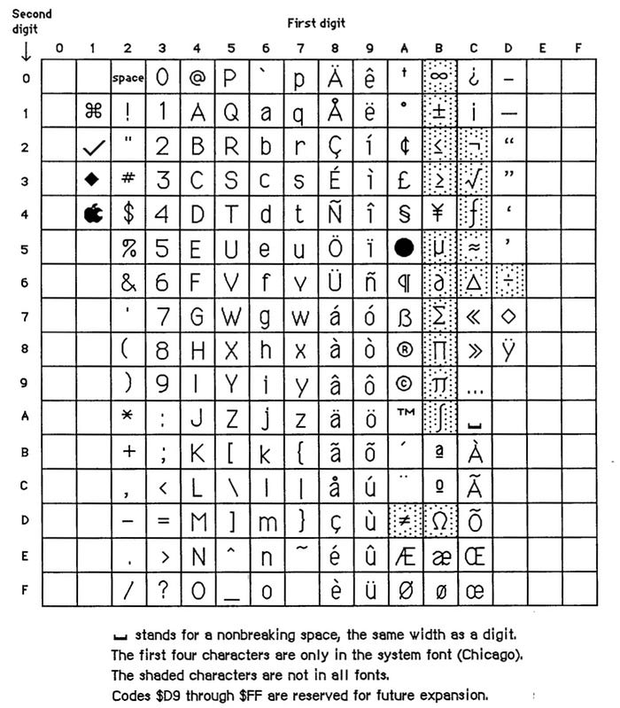
If you read the chart down the columns, moving left to right, you can see that this looks like the complete Chicago specimen reproduced earlier. In other words, Chicago has a font character for every one of the occupied boxes in the chart.
But two areas of the chart are empty: the left hand side, which are the low code numbers — by convention reserved for nonprinting control uses — and the right hand side, which, according to the caption: “Codes $D9 through $FF are reserved for future expansion.”
So those upper values (from hexadecimal value $D9 to the end at $FF) don’t correspond to any keys on the keyboard or any special combination for the international or symbol characters. So there’s no reason why any font would have any bitmap information included for a character code that couldn’t be accessed… right?
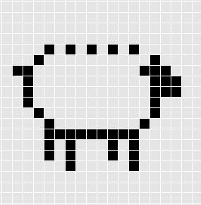
The 18-point version of Geneva includes all the characters you’d expect, and then, at position $D9, it has an adorable little sheep, shown at left. Other sizes of Geneva have different little icons in that location (a rabbit, a hieroglyph, a Mac icon). If you go down to the 9 point size, the sheep comes back again but is super tiny!
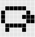
Chicago doesn’t have any character at $D9. New York does though, different ones in each of the point sizes. Some of the images are repeats of icons otherwise available in the dingbat fonts (Cairo and Taliesin). But some, like the sheep, and like the cute paw prints, below, from Athens, weren’t — they were whimsical easter eggs.
If you knew what you were looking for, there were developer tools that could reveal the hidden images to you. But I don’t believe that there was any way you’d normally see or use these $D9 characters from within the classic Mac OS .
Full rendered character sets for many of the original Macintosh fonts are uploaded here if you’d like to look for all the hidden characters (or study the pixel grid design in a convenient format).
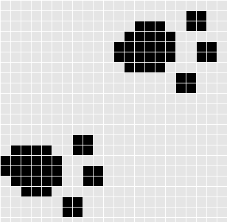
The classic Mac OS was very short on disk, RAM, and computing power. Susan Kare, Bill Atkinson, et al, did a very lot in both design and technology with very little, and even left us with hidden doodles to stumble across, all these years later.
Find me on Twitter at bzotto.
Footnote: Methodology. I used a Mac emulator on a current MacBook Pro to boot into System 7. Within that, I mounted disk images of System 1 and 2, and copied their System and Fonts files out to an HFS+ volume on my host system to preserve the resource forks (where font data lives). The handy rezycle app helped break out the resource data into binary files. The binary format of FONT resources is documented in Inside Macintosh in the section about the Font Manager. Also outlined there is the basic QuickDraw text rendering algorithm. That was enough information to build a small tool to parse the font data and draw text with it — with an optional pixel grid to make the design and spacing easier to see. I used that program to create all of the samples in the article above.
I uploaded a cleaned-up version of the program code to a project on GitHub, along with a folder full of rendered typeface specimens. Please feel free to poke around and keep in touch if you’d like to share what you’ve learned. Email address is my Medium handle, at gmail dot com.
